A qualitative berry farm established by Ms. Julija and her mother. They aspire to grow their berries as natural, delicious and healthy as possible.
The company Buba Berries seeks to let people enjoy tasty berries and feel the positive energy as much as they receive it by growing them.
(...)
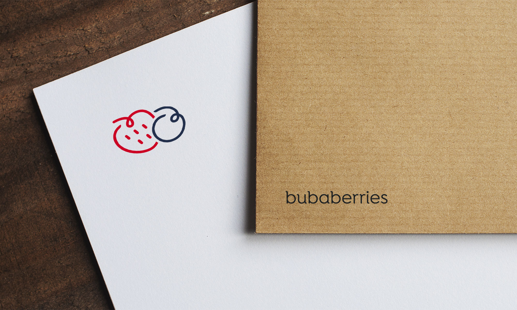
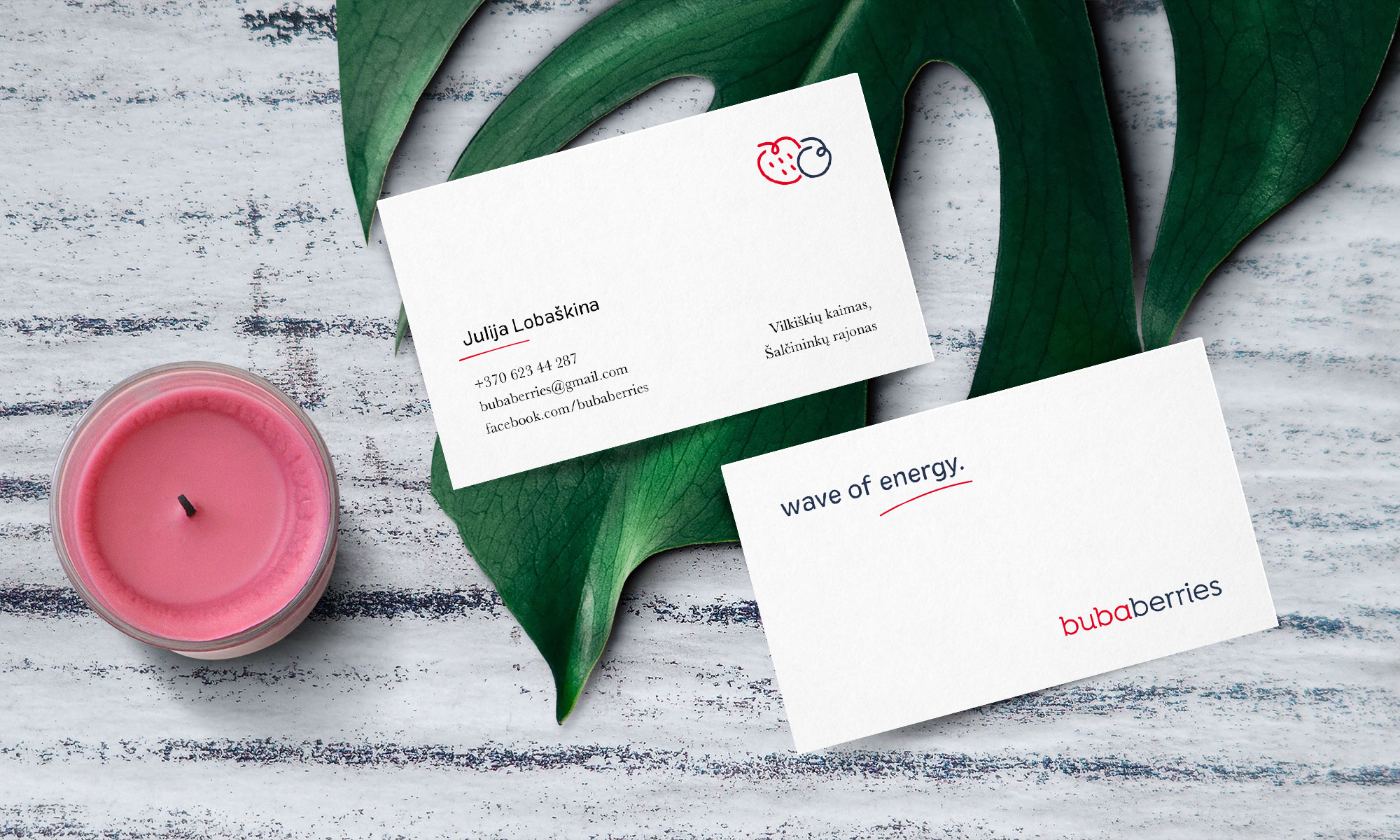
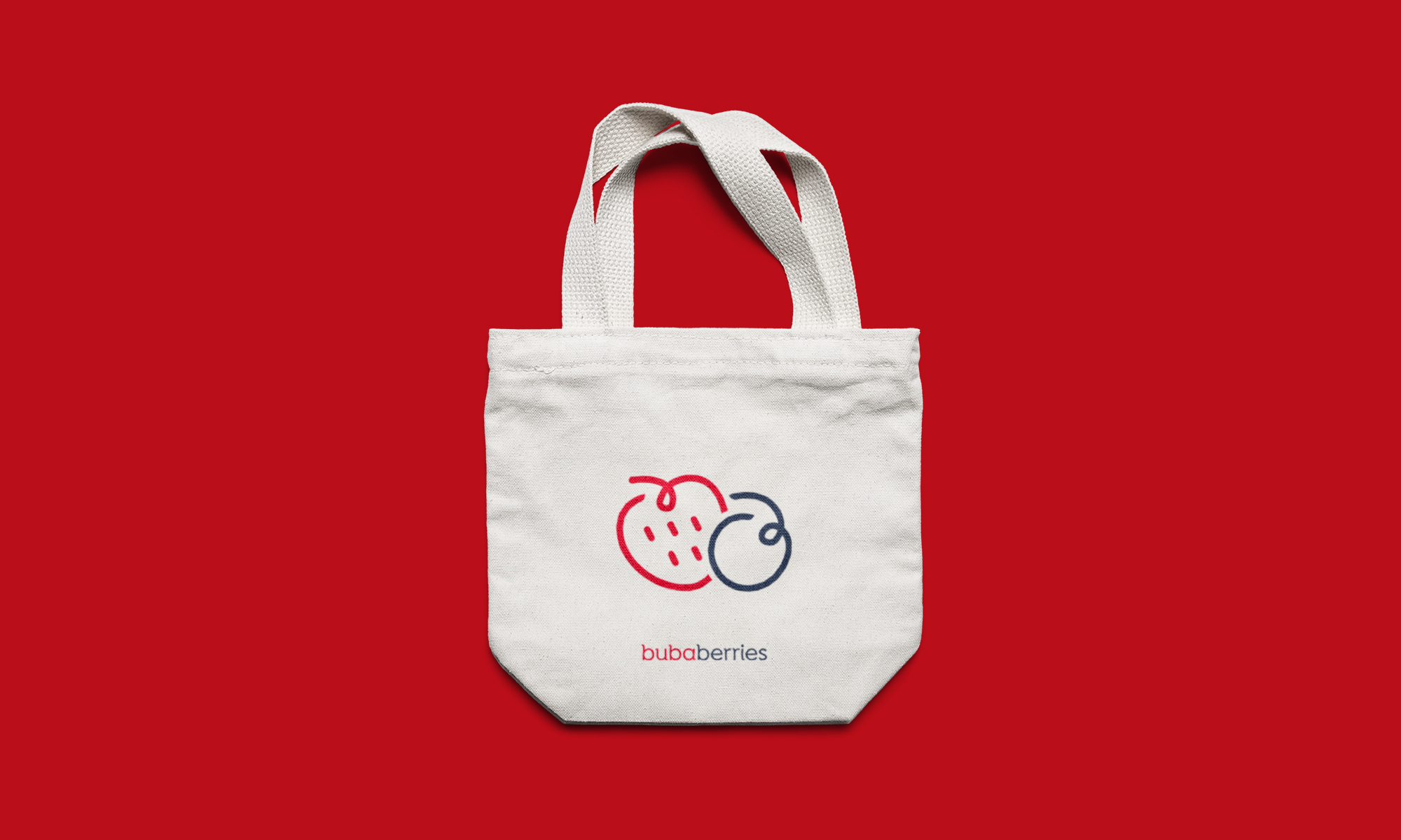
Two berries next to each other represent a close relationship, connection, trust and caring. I hand drawn the symbol to add more naturality to the logo. One of Julija’s provided statements was: “Berries which you would offer to your own child.”
Typeface chosen has a distinctive, friendly character to it to support the symbol
Colour palette was picked from strawberries and blueberries to imply variety and contrast