Aemetriks is a team of IT people, gathered to create and enhance user's experience of using their ERP system. They also work on side projects, helping other companies reach their goals by developing apps and software. Not just development is their concern, but also security and testing are their niche as well.
The main task was to create an identity to portray quality and be somewhat IT. It took me some time to grasp something to build the idea for identity. The brief was quite sketchy and at that moment aemetriks was just moving towards being aemetriks, so it wasn’t concrete information. I had to dive deep and dig into my imagination to understand, what would be best for them.
(...)
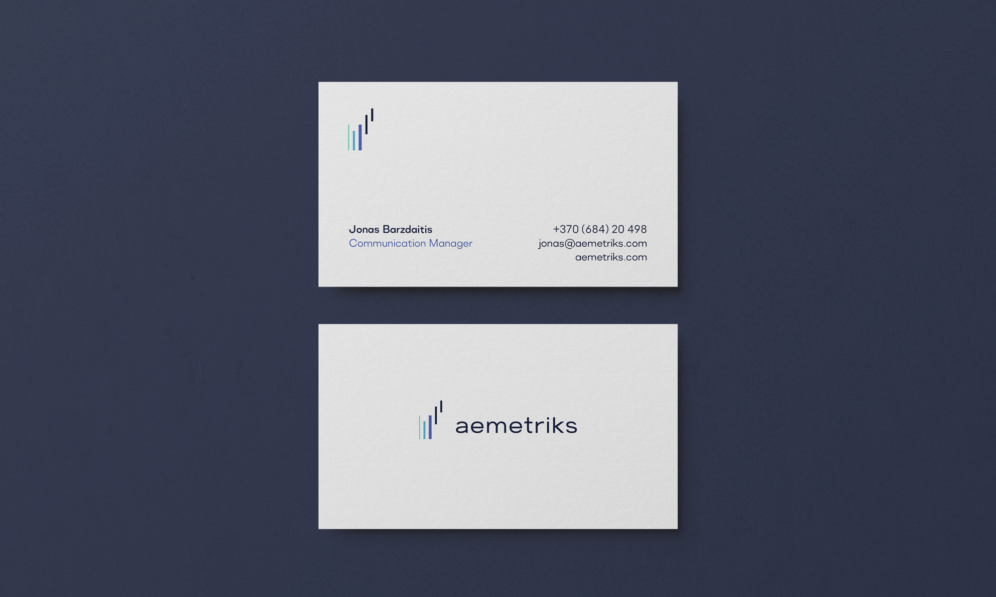
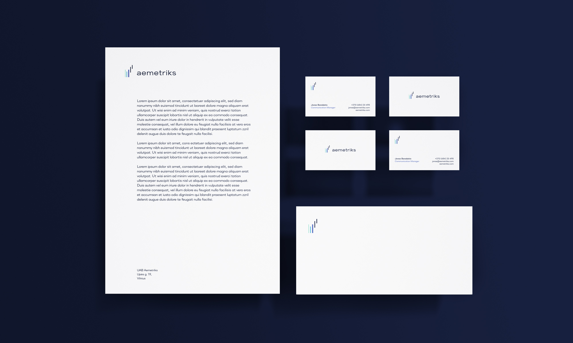
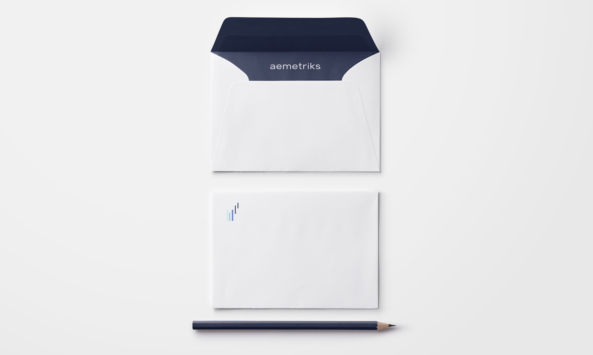
I created a solution based on constant growth and improvement. The symbol has a deeply hidden monogram “M”. The monogram rises from the word “Metriks”, to understand this, their name needs a small explanation: "ae" - the Arab Emirates and "metriks" - is well Metrics. That’s where the M come from, it’s the main piece of the name.